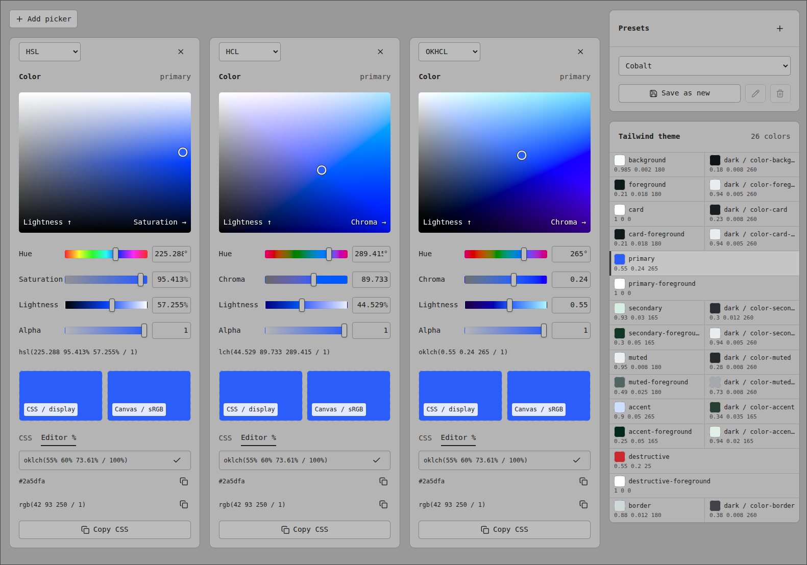
I think design systems with modular installability are neat. I often use the famous shadcdn in my side projects. Let me just quickly change the primary color to… wait, what is this?
:root {
    --background: oklch(1 0 0);
    --foreground: oklch(0.153 0.006 107.1);
    --card: oklch(1 0 0);
    --card-foreground: oklch(0.153 0.006 107.1);
    --popover: oklch(1 0 0);
    --popover-foreground: oklch(0.5 0.1 107.1);
    --primary: oklch(0.228 0.013 107.4);
The change from #rrggbb colors to this “ok” version of lch (Lightness Chroma Hue) was introduced from tailwind v3 to v4. So naturally I wondered: What was the point, why do I have to deal with this?
First big search result is this thing: oklch.com. Note the link to the explainer blog post on that page as well. It is very long, and it has to be, as this is deep color nerd territory.
How to edit the colors
For quick and easy color customizing, change only the last value (Hue) in the tailwind v4 config. Because we are using oklch, this will not cause contrast problems between text and background color on e.g. your buttons. You can try it out easily in my little app that i linked below.
Oh no, the colors are too colorful
What also happened is that some people at Apple created a color space called Display P3, which describes a wider color range compared to the “old”, normal sRGB. Cited reason for this is that old photos might look oversaturated on the newest displays.1
This is the reason why your display might not draw it’s brightest red when it sees #ff0000 anymore. In order to fix this as nicely as possible, tailwind moved to okhcl.
Why I had color.domi.ninja made
My screen has partial P3 support, so naturally I wanted to see the difference. oklch.com says “P3 is unavailable on this monitor”. This is misleading and happens because they check for full P3 compliance being advertised via a browser API.
My app skips this check. So if your display has any capabilities above sRGB, you should be able to see the difference on the bottom of the HCL and OKHCL color pickers on my app, once you cranked up chroma to the maximum (click this link). If there is a difference, then Display color is the more vibrant color.
It also
- shows the color pickers side-by-side, which helped me get a better intuitive understanding of of this topic
- has a functional tailwind theme customizer with some features I wanted and never got.
- has a color palette creator so you can test how gradients from a lerp over different color spaces looks like:

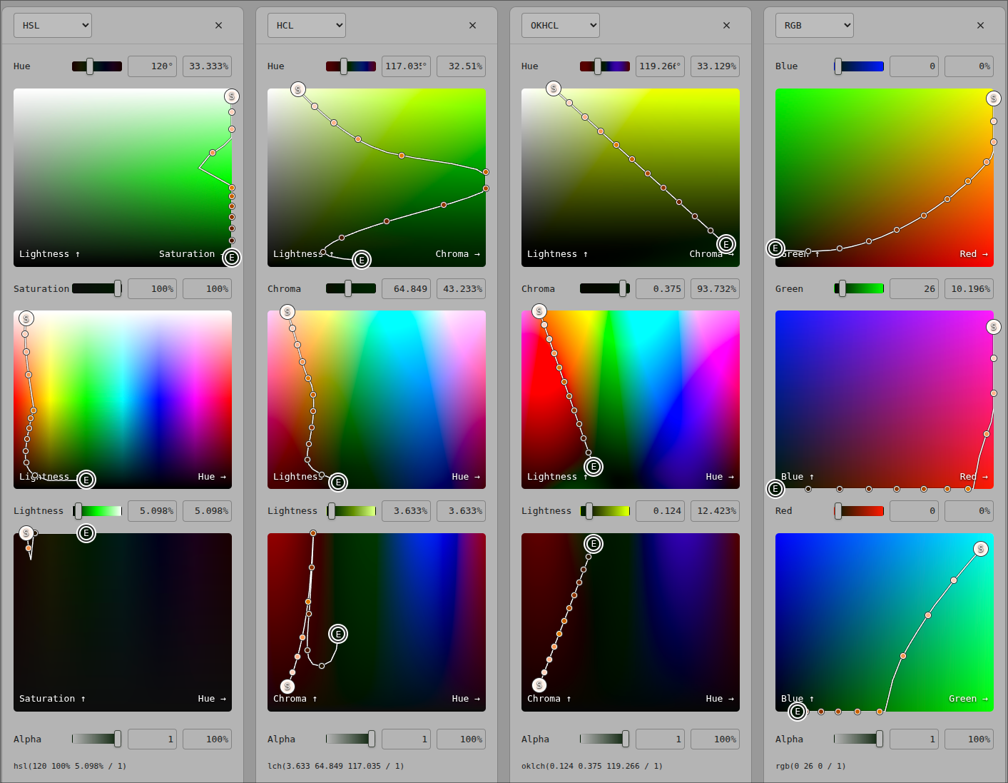 Palette can also be inserted into tailwind theme. I am not happy with this one yet.
Weird stuff
I did not confirm any of these, but it looks like that in CSS…
hclandokhclwith zero lightness can result in a non-black color, depending on hue and chroma- .
hclandokhcl0 degree hue is shifted from red to pink (compared to HSL), for some reason okhcl(...)chroma maxes out at 0.4 for whatever reason, but using 0-100% instead works as expected, bah
The End, thanks for reading
Footnotes
-
I think this argument is intellectually dishonest. Our displays have been getting better and more vibrant for decades, and now all of a sudden we need to break with sRGB? Especially since contrast has also been escalating, and I feel like the result is that users just habitually crank down their screens brightness until the result is what they expect, and that this affects color vibrancy as well. I might be old man shouting at clouds on this one. ↩